Analyzing 50 years of Tennis
In this post I will make use of Python’s libraries: pandas, matplotlib and seaborn to analyze data from ATP tennis competitions from the year 1968 up to 2018, including Grand Slams, Masters Series, Masters Cup and International Series competitions.
The dataset prepared by Jeff Sackmann contains information on every single match played since 1968. It includes details such as match’s date, location, tournament type, surface, winner and loser, score, duration and additional statistics such as players’ rankings, age and height, aces, double faults, break points faced and saved, service points among other helpful stats for both players.
The Jupyter Notebook with the full analysis can be accessed here.
Loading the data
There is one .csv file per year per tournament type. In this analysis I’m only loading atp_matches_YYYY files which contain the ATP matches for that year.
# Path to all atp_matches_YYYY.csv files
path ='tennis_atp_data'
files = glob.glob(path + "/*.csv")
tennis_df = pd.concat((pd.read_csv(f) for f in files))
Deriving new columns
First let’s derive two new columns to store year and year-month attributes.
# Extract year and month in YYYYMM format
tennis_df['tourney_yearmonth'] = tennis_df.tourney_date.astype(str).str[:6]
# Extract year in YYYY format
tennis_df['tourney_year'] = tennis_df.tourney_date.astype(str).str[:4]
Exploratory Data Analysis (EDA)
Distribution of most important attributes
We start the EDA by looking at the distribution of some of the key attributes. Histograms are very helpful to represent numerical distributions of the underlying data.
dimensions = ['winner_rank','loser_rank','winner_age','loser_age','winner_ht',
'loser_ht','w_svpt','l_svpt']

plt.figure(1, figsize=(20,12))
for i in range(1,9):
    plt.subplot(2,4,i)
    tennis_df[dimensions[i-1]].plot(kind='hist', title=dimensions[i-1])
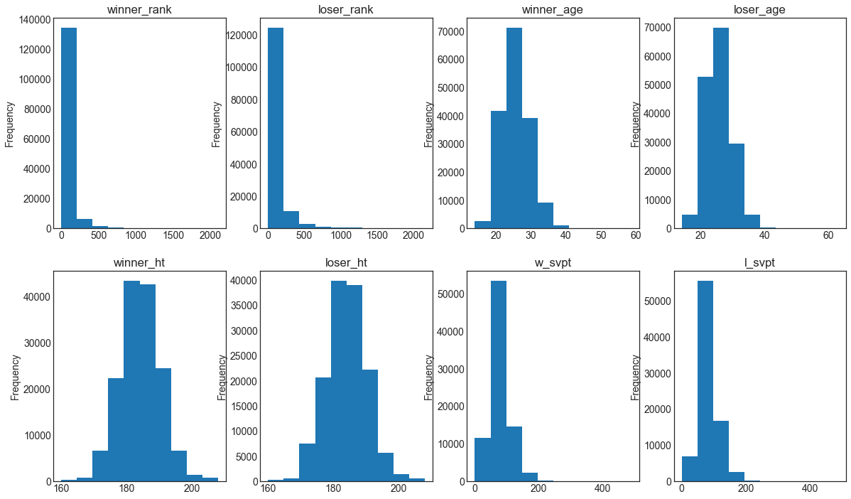
In the histograms above we see that attributes like winner_rank and loser_rank are skewed to the right (median lower than the mean). On the other hand, we see attributes like winner_ht and loser_ht which are closer to a normal distribution (bell shaped).
Evolution of winners’ rankings in Grand Slam finals
In the following graph we are using a scatter plot to represent rankings of players that won Grand Slam finals in each year. The size of the bubble indicates the ranking of the player that lost the match (the smaller the bubble, the better the ranking).
# List of Grand Slams
tourneys = ['Australian Open','Roland Garros','Wimbledon','US Open']

# Create dataframe with data of finals where winner_rank values are not null
tennis_df_1 = tennis_df[~np.isnan(tennis_df['winner_rank']) & (tennis_df['round']=='F')].copy()
plt.figure(figsize=(20,4))

# Create one plot for each Grand Slam
for i in range(1,5):
    plt.subplot(1,4,i)
    plt.title(tourneys[i-1])
    plt.scatter(tennis_df_1[tennis_df_1['tourney_name']==tourneys[i-1]]['tourney_year'],tennis_df_1[tennis_df_1['tourney_name']==tourneys[i-1]]['winner_rank'], s=tennis_df_1['loser_rank'])
    plt.gca().invert_yaxis()
    plt.ylim(50,-5)
    plt.xlabel('Year')
    plt.ylabel('Winner Ranking')

We see slight differences between Grand Slams winners’ rankings. In the US Open, rankings are more dispersed, meaning that more players with lower rankings were able to win the tournament. Also, looking at the size of the bubbles, losers had also lower rankings.
Distribution of aces by surface type
Box plots are also useful to understand distributions by looking at what are called the five number summary: minimum, first quartile, median, third quartile and maximum.
tennis_df_h = tennis_df[~np.isnan(tennis_df['w_ace']) & (tennis_df['tourney_level'].isin(['G','M'])) ].copy()
g = sns.boxplot(x="surface", y="w_ace", data=tennis_df_h)
g.set(xlabel='Surface', ylabel='Aces')
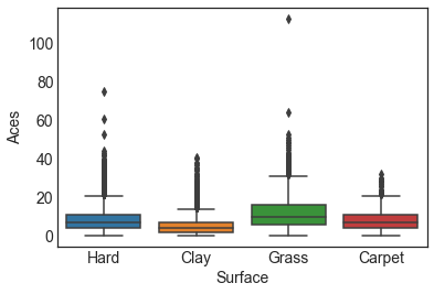
In this plot I compare the distribution of aces in each surface type. We can see, for example, that the median and maximum number of aces is much higher in grass than in clay courts. This makes sense for us tennis followers, as grass is a faster surface than clay.
Evolution of specific countries based on their players wins’
If we consider countries of current top players (Nadal, Federer, Del Potro, Djokovic, Isner), how did players of these countries perform over the years?
plt.figure(figsize=(20,4))

countries = {'ARG':'Argentina','ESP':'Spain','SUI':'Switzerland','USA':'United States','SRB':'Serbia'}
colors = ['blue','magenta','red','grey','black']

i=1
for k,v in countries.items():
    plt.subplot(1,5,i)
    s = tennis_df[(tennis_df['tourney_level'] == 'G') & (tennis_df['winner_ioc'].isin([k]))].groupby(['tourney_year','winner_ioc'], as_index=False).agg('count')
    plt.plot(s['tourney_year'], s['tourney_id'], color=colors[i-1], linestyle='dashed', marker='o', markerfacecolor='blue', markersize=2)
    if i==1:
        plt.ylabel('Number of Wins')
    plt.title(v+' in GS')
    i=i+1

Argentina, Spain and Switzerland show a huge jump in the number of wins in Grand Slams in the early 2000s that coincides with the appearances of legendary players like Coria, Nalbandian, Gaudio, Del Potro (Argentina), Robredo, Nadal (Spain) and Federer, Wawrinka (Switzerland). United States on the other hand, shows a big drop in wins after the 80s. Legends like Sampras, Agassi, Chang and others made it very difficult for the new generation to level their records. The case of Serbia is difficult to analyze because of political reasons: the country became independent in the early 2000s (before it was part of Yugoslavia). However, even if we consider this fact we have to acknowledge that the appearance of Djokovic put Serbia in the spotlight.
Players with most aces and double falts
Aces in tennis are points won by serves that are not touched by the receiver. Double falts on the other hand, are points lost by the server because of two missed serves. Here, I would like to see the players that hit the most aces in history and the ones with the most double faults. Do we find players in both lists?
# Create dataframe with details on aces by winners of each match
sw = tennis_df.groupby(['winner_name']).agg({'w_ace':'sum'}).fillna(0).sort_values(['w_ace'], ascending=False)

# Create dataframe with details on aces by losers of each match
sl = tennis_df.groupby(['loser_name']).agg({'l_ace':'sum'}).fillna(0).sort_values(['l_ace'], ascending=False)

# Concatenate dataframes
dfs = [sw,sl]
r = pd.concat(dfs).reset_index().fillna(0)

# Derive new column with total number of aces
r['aces'] = r['l_ace']+r['w_ace']

final = r.groupby('index').agg({'aces':'sum'}).sort_values('aces',ascending=False).head(10)
final = final.reset_index()
final.columns = ['Player','Aces']
final = final.sort_values('Aces',ascending=True)
final.plot('Player','Aces', kind='barh', title='Players with Most Aces', legend=False)
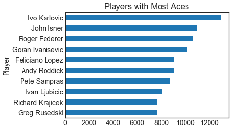
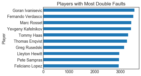
Ivanisevic, Sampras, Lopez, Rusedski are players in both lists. Aces are higher risk serves so it makes sense that the incidence of double faults is also higher in those players.
Players’ win performance over time
How did top players perform over time? Since I’m a big Federer fan, we shall start with the (current) Grand Slam record holder.
from matplotlib.ticker import MultipleLocator, StrMethodFormatter

# Function that plots the history of wins of a particular player
def plot_history_player(player):

    # Create dataframe with winner_name = player
    pldf_1 = tennis_df[(tennis_df['winner_name'] == player)].groupby(['tourney_year','tourney_level'], as_index=False).agg(['count'])
    pldf_2 = pldf_1['tourney_id'].reset_index()

    fig = plt.figure(figsize=(15,5))
    ax = fig.add_subplot(111)
    ax.set_prop_cycle(plt.cycler('color', plt.cm.jet(np.linspace(0, 1, 5))))

	# Use to define xticks as multiples of 2
    plt.gca().xaxis.set_major_locator(MultipleLocator(2))
    plt.gca().xaxis.set_major_formatter(StrMethodFormatter("{x:.0f}"))
    plt.title(player+' - Total Wins by Tournament Type by Year')
    plt.ylabel('Number of Wins')
    plt.xlabel('Year')

	# Plot tournaments by type
    plt.plot(pldf_2[pldf_2['tourney_level']=='G']['tourney_year'], pldf_2[pldf_2['tourney_level']=='G']['count'], marker='o', markerfacecolor='black', markersize=2, linewidth=3)
    plt.plot(pldf_2[pldf_2['tourney_level']=='M']['tourney_year'], pldf_2[pldf_2['tourney_level']=='M']['count'], linestyle='dotted')
    plt.plot(pldf_2[pldf_2['tourney_level']=='F']['tourney_year'], pldf_2[pldf_2['tourney_level']=='F']['count'], linestyle='dotted')
    plt.plot(pldf_2[pldf_2['tourney_level']=='D']['tourney_year'], pldf_2[pldf_2['tourney_level']=='D']['count'], linestyle='dotted')
    plt.plot(pldf_2[pldf_2['tourney_level']=='A']['tourney_year'], pldf_2[pldf_2['tourney_level']=='A']['count'], linestyle='dotted')
    plt.legend(['Grand_Slams', 'Masters', 'Tour_Finals', 'Davis_Cup', 'ATP'], loc='upper right', prop={'size': 10})

plot_history_player('Roger Federer')
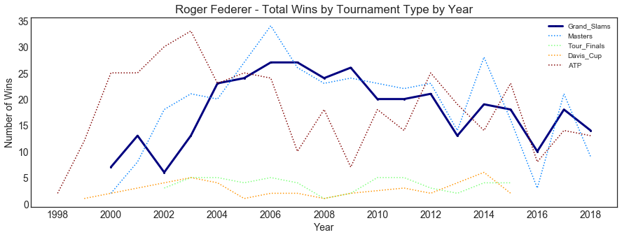
The Swiss started with ATP wins in 1998 reaching his peak in 2003 when he started winning Grand Slam matches as well.
Now, let’s see how Nadal did over the years..
plot_history_player('Rafael Nadal')
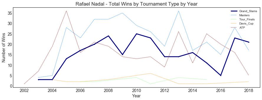
We see a similar behaviour in the case of Rafa. He reaches a peak in ATP matches wins and then starts winning more Grand Slam matches. This happens in both players because when they start competing, they play a lot of (ATP) tournaments until they get to a point where they focus on the major tournaments (Masters, Grand Slams, few 500 ATP).
Dominance
Unique number of players that won Grand Slam and Master tournaments (by year)
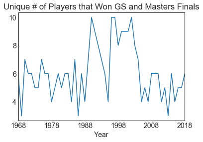
How many unique players won the biggest tournaments per year since 1968?
# Unique number of players that won GS and Masters per year
s = tennis_df[(tennis_df['round']=='F')&(tennis_df['tourney_level'].isin(['M','G']))].groupby(['tourney_year']).agg({'winner_name':'nunique'})
t= s.reset_index()
t.columns=['Year','Unique_Winners']
t.plot('Year', 'Unique_Winners', kind='line', title='Unique # of Players that Won GS and Masters Finals', legend=False)
Unique number of players that won Grand Slam tournaments (by periods)
We know that the last decade in tennis was pretty much dominated by few players (Federer, Nadal, Djokovic). Let’s look at that in a plot.
# Unique number of players that won GS and Masters per period
s = tennis_df[(tennis_df['round']=='F')&(tennis_df['tourney_level'].isin(['G']))&(tennis_df['tourney_year'].between('1975','1985'))].agg({'winner_name':'nunique'})
t = tennis_df[(tennis_df['round']=='F')&(tennis_df['tourney_level'].isin(['G']))&(tennis_df['tourney_year'].between('1986','1996'))].agg({'winner_name':'nunique'})
u = tennis_df[(tennis_df['round']=='F')&(tennis_df['tourney_level'].isin(['G']))&(tennis_df['tourney_year'].between('1997','2007'))].agg({'winner_name':'nunique'})
v = tennis_df[(tennis_df['round']=='F')&(tennis_df['tourney_level'].isin(['G']))&(tennis_df['tourney_year'].between('2008','2018'))].agg({'winner_name':'nunique'})

s['1975-1985'] = s['winner_name']
s=s.drop('winner_name')
t['1986-1996'] = t['winner_name']
t=t.drop('winner_name')
u['1997-2007'] = u['winner_name']
u=u.drop('winner_name')
v['2008-2018'] = v['winner_name']
v=v.drop('winner_name')

dfl = [s,t,u,v]
dfs = pd.concat(dfl)
x=pd.DataFrame(dfs, columns=['Unique_Count']).reset_index()
x.columns=['Year range','Unique winners']
ax=x.plot('Year range', 'Unique winners', kind='bar', title='Unique # of Players that Won GS Finals', legend=False)
ax.set_ylim(0,20)

for i, v in enumerate(x['Unique winners']):
    ax.text(i-0.1, v+0.6, str(v))
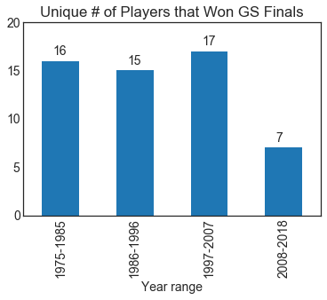
Dominance is pretty clear in this graph. There were between 15 and 17 unique winners in the three previous periods and only 7 in the last decade!
Players’ effectiveness by surface types
What is the effectiveness of top ranked players? Effectiveness is measured by the number of wins over the total matches played.
Let’s start with Roger again.
from matplotlib.ticker import MultipleLocator, StrMethodFormatter

# Function to plot effectiveness of a player
def plot_effectiveness(player):
    pw = tennis_df[(tennis_df['winner_name'] == player)].groupby(['tourney_year','surface'], as_index=False).agg(['count'])
    pww = pw['tourney_id'].reset_index()

    pl = tennis_df[(tennis_df['loser_name'] == player)].groupby(['tourney_year','surface'], as_index=False).agg(['count'])
    pll = pl['tourney_id'].reset_index()

    pww.columns = ['tourney_year','surface','wins']
    pll.columns = ['tourney_year','surface','loses']

    dfs = (pww,pll)
    dfs_concat = pd.concat(dfs)

    dfs_final = dfs_concat.fillna(0).groupby(['tourney_year','surface']).agg({'wins':'sum','loses':'sum'}).reset_index()

    dfs_final['r_eff'] = np.where(dfs_final['loses']>0, dfs_final['wins']/(dfs_final['wins']+dfs_final['loses']), 1)
    dfs_final['tourney_year'] = dfs_final['tourney_year'].astype(int)

    g = sns.lmplot(x='tourney_year', y='r_eff', hue='surface', fit_reg=False, data=dfs_final, palette='viridis', hue_order=['Hard','Carpet','Grass','Clay'])
    g.fig.suptitle(player + ' - Effectiveness')
    g.set(xlabel='Year', ylabel='Effectiveness')
    g.set(ylim=(-0.1,1.2))

plot_effectiveness('Roger Federer')
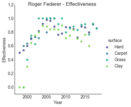
Federer’s effectiveness reached its peak between 2005 and 2010, reaching up to 100% on grass tournaments with a good performance on hard courts as well. The effectiveness on clay on the other hand considerably lower.
Now let’s see how Nadal did.
plot_effectiveness('Rafael Nadal')
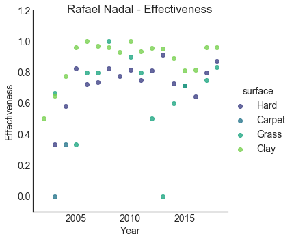
Nadal shows a strong effectiveness on clay tournaments (no surprise here, as he is named the King of Clay).
Age of Grand Slam champions over time
Are Grand Slams champions younger or older as time goes by? In which Grand Slams do we find the youngest and oldest champions?
# Create dataframe with age of winners filtering Grand Slam finals
tennis_df_win=tennis_df[tennis_df['tourney_level'].isin(['G'])&(tennis_df['round']=='F')].dropna(subset=['winner_age'])
dfw = tennis_df_win[['tourney_year','tourney_name','winner_name','winner_age']]
dfw.columns = ['tourney_year','tourney_name','player','age']

dfs_final = dfw.groupby(['tourney_year','tourney_name']).agg({'age':'mean'}).reset_index()
dfs_final_2 = dfs_final.groupby(['tourney_year']).agg({'age':'mean'}).reset_index()

fig = plt.figure(figsize=(15,5))
ax = fig.add_subplot(111)
ax.set_prop_cycle(plt.cycler('color', plt.cm.jet(np.linspace(0, 1, 5))))

plt.title('Age of Grand Slams Champions 1968-2018')
plt.ylabel('Age')
plt.xlabel('Year')

plt.plot(dfs_final_2['tourney_year'], dfs_final_2['age'])
plt.scatter(dfs_final[dfs_final['tourney_name']=='Australian Open']['tourney_year'], dfs_final[dfs_final['tourney_name']=='Australian Open']['age'], alpha=0.3)
plt.scatter(dfs_final[dfs_final['tourney_name']=='Roland Garros']['tourney_year'], dfs_final[dfs_final['tourney_name']=='Roland Garros']['age'], alpha=0.3)
plt.scatter(dfs_final[dfs_final['tourney_name']=='Wimbledon']['tourney_year'], dfs_final[dfs_final['tourney_name']=='Wimbledon']['age'], alpha=0.3)
plt.scatter(dfs_final[dfs_final['tourney_name']=='US Open']['tourney_year'], dfs_final[dfs_final['tourney_name']=='US Open']['age'], alpha=0.3)

plt.legend(['All Grand Slams Avg.','Australian Open', 'Roland Garros', 'Wimbledon', 'US Open'], loc='upper center',prop={'size': 9})
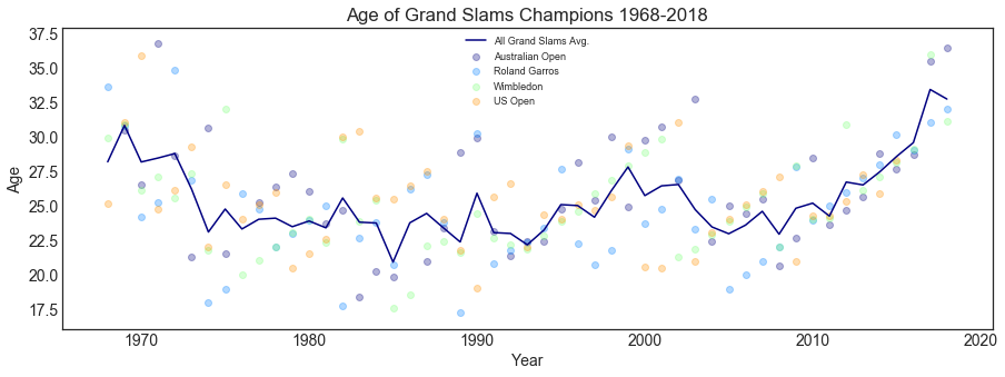
The first Grand Slams champions were in their 30s but then in mid-1970 younger champions emerged. The average age became pretty stable after that until around 2010 where we see a steady increase in the average age of champions. So, what happened here? Legends started getting older but they kept on winning titles: Federer won his 20th Grand Slam in 2018 Australian Open with 36 years of age!
Retirements
What is the evolution of retirements over time? In which tournament do we see most of these retirements?
# Extract retirements
ret_df = tennis_df[tennis_df['score'].str.contains("RET")==True][['tourney_year','tourney_level','surface','tourney_id','winner_name']]
ref_df_f = ret_df.groupby(['tourney_year','surface'], as_index=False).agg('count')

fig = plt.figure(figsize=(15,5))
ax = fig.add_subplot(111)
plt.style.use('seaborn-colorblind')

plt.title('Retirements - Evolution of Retirements by Surface')
plt.ylabel('Number of Retirements')
plt.xlabel('Year')
plt.plot(ref_df_f[ref_df_f['surface']=='Hard']['tourney_year'], ref_df_f[ref_df_f['surface']=='Hard']['tourney_id'], linestyle='solid', linewidth=2, solid_capstyle='projecting')
plt.plot(ref_df_f[ref_df_f['surface']=='Grass']['tourney_year'], ref_df_f[ref_df_f['surface']=='Grass']['tourney_id'], linestyle='solid', marker='o', markerfacecolor='black', markersize=1, linewidth=3)
plt.plot(ref_df_f[ref_df_f['surface']=='Clay']['tourney_year'], ref_df_f[ref_df_f['surface']=='Clay']['tourney_id'], linestyle='solid', marker='o', markerfacecolor='black', markersize=1, linewidth=3)
plt.plot(ref_df_f[ref_df_f['surface']=='Carpet']['tourney_year'], ref_df_f[ref_df_f['surface']=='Carpet']['tourney_id'], linestyle='solid', marker='o', markerfacecolor='black', markersize=1, linewidth=3)

# Calc the trendline for hard court
x = ref_df_f[ref_df_f['surface']=='Hard']['tourney_year'].astype(int)
y = ref_df_f[ref_df_f['surface']=='Hard']['tourney_id'].astype(int)
z = np.polyfit(x, y, 1)
p = np.poly1d(z)
plt.plot(x, p(x),"r--", alpha=0.2)

plt.legend(['Hard', 'Grass', 'Clay', 'Carpet'], loc='upper left', prop={'size': 14})
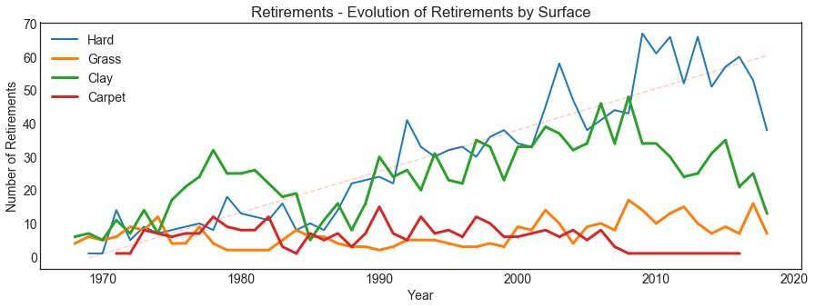
Is is just that we have more retirements because there are more matches played in that particular torunament or surface? What if we consider the ratio of retirements over matches played?
ret_df_f = ret_df.groupby(['tourney_year','surface'], as_index=False).agg('count')[['tourney_year','surface','tourney_id']]
ret_df_f.columns = ['tourney_year','surface','rets']

notret_df = tennis_df[tennis_df['score'].str.contains("RET")==False][['tourney_year','surface','tourney_id']]
notret_df_f = notret_df.groupby(['tourney_year','surface'], as_index=False).agg('count')[['tourney_year','surface','tourney_id']]
notret_df_f.columns = ['tourney_year','surface','norets']

dfs = (ret_df_f, notret_df_f)
dfs_concat = pd.concat(dfs)

dfs_c = dfs_concat.fillna(0).groupby(['tourney_year','surface']).agg({'rets':'sum','norets':'sum'}).reset_index()

dfs_c['ret_ratio'] = np.where(dfs_c['norets']>0, dfs_c['rets']/(dfs_c['rets']+dfs_c['norets']), 1)

fig = plt.figure(figsize=(15,5))
ax = fig.add_subplot(111)
plt.style.use('seaborn-colorblind')

plt.title('Retirements - Evolution of Retirements by Surface')
plt.yscale('log') # Using log scale
plt.ylabel('Retirements ratio (log)')
plt.xlabel('Year')

plt.plot(dfs_c[dfs_c['surface']=='Hard']['tourney_year'], dfs_c[dfs_c['surface']=='Hard']['ret_ratio'], linestyle='solid', linewidth=2, solid_capstyle='projecting')
plt.plot(dfs_c[dfs_c['surface']=='Grass']['tourney_year'], dfs_c[dfs_c['surface']=='Grass']['ret_ratio'], linestyle='solid', marker='o', markerfacecolor='black', markersize=1, linewidth=3)
plt.plot(dfs_c[dfs_c['surface']=='Clay']['tourney_year'], dfs_c[dfs_c['surface']=='Clay']['ret_ratio'], linestyle='solid', marker='o', markerfacecolor='black', markersize=1, linewidth=3)

plt.legend(['Hard','Grass', 'Clay'], loc='upper left', prop={'size': 14})
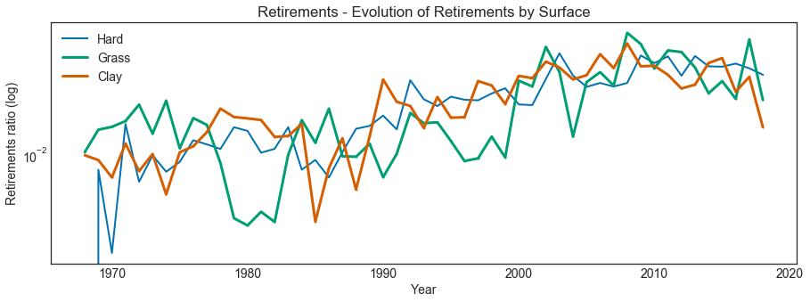
This plot, which uses a log-scale, shows that there is effectively an upward trend in retirements ratio, although not specific to any surface.
Top rivalries by decade
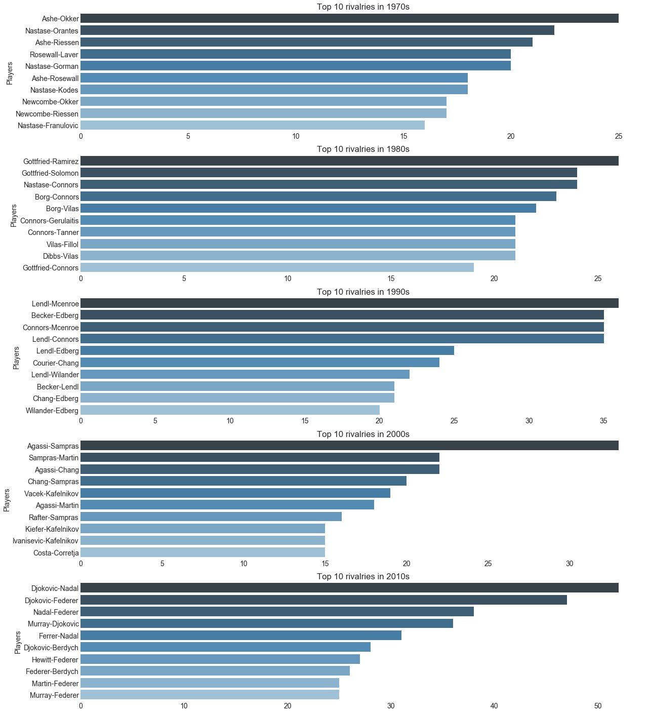
What are the top rivalries in tennis’ history based on the number of matches played between players?
We might think Federer vs. Nadal is the biggest rivalry but they actually haven’t played the most matches together as we shall see..
h2h_wl = tennis_df_all.groupby(['winner_name','loser_name']).agg({'tourney_id':'count','tourney_year':'max'}).reset_index()
h2h_wl.columns = ['player_a','player_b','total','year']

h2h_lw = tennis_df_all.groupby(['loser_name','winner_name']).agg({'tourney_id':'count','tourney_year':'max'}).reset_index()
h2h_lw.columns = ['player_a','player_b','total','year']

h2h_f = h2h_wl.merge(h2h_lw, on=['player_a', 'player_b'])
h2h_f['total'] = h2h_f['total_x'] + h2h_f['total_y']

h2h_f['player_a'] = np.where(h2h_f['player_a'] < h2h_f['player_b'], h2h_f['player_a'], h2h_f['player_b'])
h2h_f['player_b'] = np.where(h2h_f['player_a'] > h2h_f['player_b'], h2h_f['player_a'], h2h_f['player_b'])
h2h_f['year'] = np.where(h2h_f['year_x'] > h2h_f['year_y'], h2h_f['year_x'], h2h_f['year_y'])
h2h_f['names'] = h2h_f['player_a'].str.split(" ").str.get(1) + "-" + h2h_f['player_b'].str.split(" ").str.get(1)

h2h_f2 = h2h_f.groupby(['player_a','player_b','names']).agg({'total':'max','year':'max'}).reset_index()
h2h_f2_sorted = h2h_f2[h2h_f2['player_a']!=h2h_f2['player_b']].sort_values(['total'], ascending=False)#.head(20)

h2h_f2_sorted['year_period'] = pd.cut(h2h_f2_sorted.year.astype(int), [1968, 1979, 1989, 1999, 2009, np.inf], labels=['1970s','1980s','1990s','2000s', '2010s'])

plt.figure(figsize=(20,25))

plt.subplot(5,1,1)
ax1=sns.barplot(x="total", y="names", palette='Blues_d', data=h2h_f2_sorted[h2h_f2_sorted.year_period=='1970s'].head(10))
ax1.set(xlabel='', ylabel='Players', title='Top 10 rivalries in 1970s')

plt.subplot(5,1,2)
ax2=sns.barplot(x="total", y="names", palette='Blues_d', data=h2h_f2_sorted[h2h_f2_sorted.year_period=='1980s'].head(10))
ax2.set(xlabel='', ylabel='Players', title='Top 10 rivalries in 1980s')

plt.subplot(5,1,3)
ax3=sns.barplot(x="total", y="names", palette='Blues_d', data=h2h_f2_sorted[h2h_f2_sorted.year_period=='1990s'].head(10))
ax3.set(xlabel='', ylabel='Players', title='Top 10 rivalries in 1990s')

plt.subplot(5,1,4)
ax4=sns.barplot(x="total", y="names", palette='Blues_d', data=h2h_f2_sorted[h2h_f2_sorted.year_period=='2000s'].head(10))
ax4.set(xlabel='', ylabel='Players', title='Top 10 rivalries in 2000s')

plt.subplot(5,1,5)
ax5=sns.barplot(x="total", y="names", palette='Blues_d', data=h2h_f2_sorted[h2h_f2_sorted.year_period=='2010s'].head(10))
ax5.set(xlabel='', ylabel='Players', title='Top 10 rivalries in 2010s')

sns.despine(left=True, bottom=True)
Key insights
To summarize, the key insights that I got from this analysis are:
-
Grass and hard courts have a higher incidence in the number of aces.
-
Many players appear in both rankings of top aces and double faults in history. More aces could mean taking higher risks that could lead to a higher number of double faults.
-
In the last ten years of professional tennis only 7 players have won most of the big tournaments as compared to an average of 16 players in previous decades.
-
The average age of champions increased in the last few years. This seems to be due to dominance from the same players that were getting older each year.
-
There is an upward trend in retirements ratio in recent years with no clear difference between surface types.
-
In the 80s rivalries were more even. In the 90s there was a rivalry that stood out and in the 2010s the rivalries were shared between few players with a higher number of encounters.
Conclusion and future work
Well, I hope you have enjoyed this analysis as much I enjoyed working on it!
There is definitely much more that could be done with this data, here are a few ideas:
- Answers additional questions like:
- Who are the players that reverted most matches in Grand Slam tournaments? (e.g. ended up winning after losing two sets to zero)
- Who are the players with the longest winning and losing streaks?
-
Apply unsupervised ML techniques to create players segmentation based on statistics like aces, scores, retirements, etc.
- Apply supervised ML techniques to predict future performance of players
